Download PDF
Brand guidelines · Version 1.0 · August 2026

How WestDigital looks, sounds and moves.

For partners, press and everyone who puts the name on a page: the logo and how to use it, colour and type, composition, the product family, imagery, motion, voice, and every file you need.

01

The brand

What WestDigital is

Software and AI for airlines, rail and cruise operators: passenger experiences that adapt to each person, insight from the data journeys create, and the operational leverage that follows.

WestDigital is built by the team behind entertainment services for airlines, private jets and cruise operators. It is the home of four products.

WestIQ
The intelligence layer: personalization, recommendations, analytics, advertising, commerce and passenger insight.
Stream
The streaming platform.
StreamIQ
Stream with WestIQ built in.
TOM
AI-assisted content review and content intelligence for in-flight entertainment.

The name is written WestDigital, one word, capital W and capital D, everywhere including legal lines: © 2026 WestDigital. No other company name appears on a WestDigital surface.

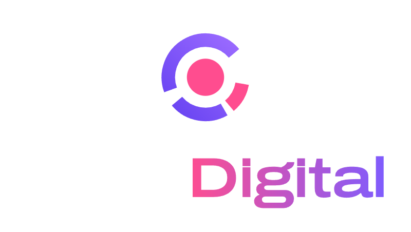
WestDigital stacked lockup

The idea in the mark

The WestDigital mark

The passenger is the solid centre. Intelligence compounds around them.

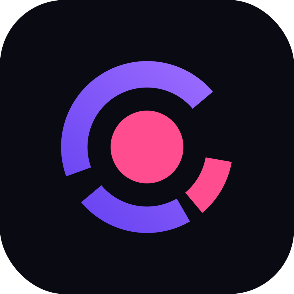
One orbit of three arcs whose lengths double, forty, eighty, one hundred and sixty degrees, with gaps that double too. Each pass around the individual, the system knows twice as much. The opening is where the next doubling would land, and in the lockup it faces the name.

The name carries the second idea. West is set in solid ink; Digital takes a two-stop ramp from pink to ultraviolet that starts exactly where the two words meet. That seam is the company story: an established travel operator crossing into software and AI, with the digital half carrying the energy.

Together they give the brand one sentence to live by: everything WestDigital builds is arranged around one person.

03

Colour

The palette

Orbit
Core
Night

Click any step to copy its code. Each colour has a scale from 50 to 950; the brand values are Orbit 500 and Core 500 on dark grounds, Orbit 600 and Core 600 on light grounds. Each swatch carries its CMYK value; see In print for the profile, the gamut and the print files.

Using colour

Dark surfaces

Ground
Raised surface
Line
Text
Secondary text
Tertiary text
Link
Button fill
Emphasis

Light surfaces

Ground
Raised surface
Line
Text
Secondary text
Tertiary text
Link
Button fill
Emphasis

Contrast

Text on groundRatioUse
Paper on Night19.72AAA
Night 300 on Night8.63AAA
Night 400 on Night6.26AA
Orbit 400 on Night5.58AA
Orbit 500 on Night4.55AA
Core 500 on Night6.30AA
Night on Paper19.72AAA
Night 600 on Paper6.59AA
Night 500 on Paper4.45AA large
Orbit 600 on Paper5.61AA
Core 600 on Paper4.43AA large
Paper on Orbit 6005.61AA

The seam ramp and proportion

#FF4D8F#7D5CFF
#E0257E#6A45F2

The ramp runs in one direction, from Core to Orbit, with two stops. It appears once per composition: in the wordmark's Digital, or on one hero element, or on one tile. It is never applied to West, to body text, to buttons or to more than one thing on a page. Angle: horizontal in the wordmark, 45 degrees rising to the right on tiles and fields.

Night or Paper 70Ink 20Orbit 8

Proportion on any surface: about seventy percent ground, twenty percent ink, eight percent Orbit, and Core as the last two percent. Core is a signal, not a colour scheme; if a page has more than one pink element, one of them is wrong.

Dark is the brand's home. Light surfaces are for documents, partner materials and anything that has to print well; both are complete systems and every asset exists for both.

In print

Print values are conversions, made properly. Every CMYK value on this page is an ICC conversion from the screen colour to Coated GRACoL 2006 (ISO 12647-2), relative colorimetric with black point compensation; the values file in the asset pack carries Coated FOGRA39 as well for printers who proof to the ISO reference. Give your printer the value and the profile name together; a number without its profile means nothing on press.

Some of the brand does not exist in four-colour process. Orbit, the brand violet, sits well outside the CMYK gamut: the process build prints as a dull slate, and no mix of four inks reaches it. For anything where the violet matters, print it as a spot ink matched to the hex, and proof it. The WestIQ signal blue and the Stream teal lose part of their chroma the same way; Core pink, TOM orange, the gold and every neutral print faithfully. The table marks which is which.

Night is 100 K. As ink, for type and logos, Night prints as solid black. The rich black listed for Night 950 is for large fields only, never for type, and never under a small mark.

One set of values on every ground. A mark is the same hex on white as on Night; nothing shifts with the background. Only ink changes with the ground: the wordmark and the product names are white on dark surfaces and Night on light ones.

The flat cut is the brand in print. Gradients are for screens. Every print file in the pack is the flat cut: vector, CMYK, one core of clear space built in, ready for a printer as it is. Use the reverse cut on dark stock and the one-colour cut on one-ink jobs.

ColourHexRGBCMYK, Coated GRACoL 2006PressUse
Orbit#7D5CFF125 92 255C71 M68 Y0 K0outside the gamut: spot inkthe mark, the ramp, on every ground
Core#FF4D8F255 77 143C0 M80 Y7 K0proof on pressthe core, the ramp, on every ground
Night 950#0A0A1210 10 18C89 M82 Y65 K87prints faithfullyink: 100 K; the rich black is for fields
Night 600#5C5B7092 91 112C66 M59 Y36 K20prints faithfullysecondary text on paper
Paper#FFFFFF255 255 255C0 M0 Y0 K0prints faithfully
WestIQ signal#2679EB38 121 235C79 M51 Y0 K0outside the gamut: spot inkthe bezel
WestIQ inner#73B1FF115 177 255C53 M22 Y0 K0proof on pressthe inner ring
Gold#EEA743238 167 67C5 M39 Y80 K0prints faithfullyWestIQ and StreamIQ
Stream teal#2ED3B746 211 183C64 M0 Y38 K0proof on pressthe flat cut
TOM orange#FF7A45255 122 69C0 M64 Y73 K0prints faithfullythe flat cut
04

Typography

One family, one axis

WestDigital

Archivo across its width axis is the whole typographic system.

The name sits at the wide end of the axis, width 125 and weight 600, and is only ever used as the outlined wordmark. Display lines step in to width 118; titles to 112; headings to 106; body text runs at the normal width, 100, weight 400. The effect is one voice that gets wider and more certain as it gets larger, and the wordmark is its loudest register.

B612 Mono is the second voice, the instrument voice shared with WestIQ. It is for eyebrows, codes, data, timestamps and captions set in capitals with wide tracking, never for paragraphs.

Both faces are published under the SIL Open Font License and come with the asset pack. Fallbacks: Archivo, system-ui, sans-serif; B612 Mono, ui-monospace, monospace.

The scale

Smarter with every mile.

Passenger intelligence for the connected cabin

Recommendations with reasons

WestIQ recommends what each passenger is likely to watch next, and says why. Search the catalog in plain language. Personas keep a family sharing one screen from being treated as one viewer.

Small text carries captions, footers and legal lines.

B612 MONO · EYEBROWS · CODES · 14:32:07

RoleSize / leadingWidthWeightTrackingUse
Wordmarkoutlined125600as drawnthe logo only
Display56 / 1.02118560-0.022 emhero lines, deck covers
Title36 / 1.1112540-0.018 emsection titles
Heading24 / 1.2106520-0.012 emcards, sub-heads
Body17 / 1.551004000paragraphs, up to 66 characters a line
Small14 / 1.51004200captions, footers, legal
Mono11 / 1.4B612 Mono400+0.14 em, capitalseyebrows, codes, data, timestamps

Sentence case everywhere, including titles and buttons. No faux bold or italics; Archivo has real weights. Never set the name WestDigital in live type where the wordmark belongs.

05

Composition

Grid and space

Twelve columns, 24 px gutters, 1200 px maximum content width, 24 px page margin on small screens and 48 px above 900 px.

Spacing steps: 4, 8, 12, 16, 24, 32, 48, 64, 96, 128 px. Corner radius: 8 px for controls, 14 px for cards and tiles, 24 px for large panels; app tiles use 22 percent of their side.

Space is the brand's quietest asset and its most used. The lockup gets one core of clear space; sections get at least 96 px between them; a paragraph never runs past 66 characters. When in doubt, remove one thing and add space.

Corners are rounded, never sharp and never pill-shaped except on small buttons. Borders are one pixel of the Line colour. Shadows are not used on dark surfaces; on light surfaces a card may carry a single soft shadow at 8 percent opacity.

Placing the mark

Hero: lockup top left, message below, opening toward the text
Cover: stacked lockup centred, one line beneath
Brand guidelines · 2026
Document: wordmark in the running header, mono line opposite

The mark's opening faces the message: left of a headline, above a line of copy, toward the centre of a composition. It never points off the page. On a photograph the lockup sits on a Night scrim of at least 60 percent, never directly on the image.

One ramp per composition. If the wordmark's Digital is on the page, no other element carries the gradient; if a hero field carries it, the lockup in that composition uses its flat cut.

06

Family

One orbit, five products

WestDigitalWestDigital
WestIQ
StreamStream
StreamIQStreamIQ
TOMTOM
WestDigitalWestDigital
WestIQ
StreamStream
StreamIQStreamIQ
TOMTOM

Every product mark is the parent's orbit: radius 22, stroke 8, flat ends, the opening at 75 degrees toward the name, around the same solid core in Core pink. The core is the passenger, and it is the same passenger in every product. What changes is the number of arcs and the hue. The parent doubles, three arcs. Stream flows, one unbroken arc. TOM reviews, two arcs that read as brackets around the centre.

WestIQ carries the instrument: a bezel and an inner ring in signal blue, the gold tail seated in the ring at four thirty, and a gold pupil at the centre, the passenger as the signal. StreamIQ is Stream with that same gold at its head: WestIQ inside Stream. Product hues never appear in the parent's mark, and the parent's ultraviolet ramp never appears in a product's.

Product lockups

WestIQ by WestDigital Stream by WestDigitalStreamIQ by WestDigitalTOM by WestDigital

A product lockup is its mark, its name in the same register as the parent but one weight lighter, and the line "by WestDigital" beneath, with the parent's wordmark in ink. Products never wear the seam ramp; the endorsement is quiet on purpose.

Names: WestIQ, Stream, StreamIQ and TOM, on first mention as "Stream by WestDigital". The parent's own legal line is "© 2026 WestDigital"; no other company name appears on WestDigital or product surfaces.

Product colour

Aurora · Stream and StreamIQ

Ember · TOM

Signal and gold · WestIQ

WestIQ's palette at family strength, the same values on every ground. The gold is the mark of WestIQ intelligence and appears on StreamIQ for that reason only.

07

Imagery and motion

Imagery

Orbit field: abstract imagery generated from the mark's own geometry.

Product surfaces. Show the products as they are: real screens on a dark ground, no invented interfaces, no retouched results.

Orbit fields. Abstract imagery is built from the mark: arcs at doubling radii, one ramp, on Night, with a single Core point. It replaces stock illustration everywhere.

Photography. Travel in progress, seen calmly: a cabin at cruise, a screen in use, a platform at first light. Natural light, quiet colour, no clouds with a plane through them, no handshakes, no staged smiles. People are never identifiable without consent, and no airline, aircraft or partner is identifiable unless they have agreed to appear.

Motion

0 ms · 40°
120 ms · 80°
360 ms · 160°
840 ms · core

The brand has one motion signature. The arcs draw clockwise in doubling time: 40 degrees over 120 ms, 80 over 240, 160 over 480; the core lands at 840 ms; the seam ignites across Digital at one second. After that the seam breathes on an eight second loop, a slow drift of the pink and the violet along the word.

It plays once per page, where the brand is introduced: the cover of this guide, the hero of the website, the first slide of a deck. The breathing loop is reserved for WestDigital's own surfaces; partner materials use the static lockup.

Everything else is restrained: 200 ms ease-out transitions, a two pixel lift on hover, and nothing that loops. When a viewer has asked for reduced motion, the finished mark is shown and nothing moves.

08

Voice

How WestDigital writes

Say what it does. Then stop.

  • Short sentences, present tense, active voice. The product does something; say what.
  • Specific beats grand. No superlatives, no "revolutionary", no "seamless". Numbers only when they are true and approved.
  • Quiet about the machinery. WestDigital never names the suppliers, cloud providers or models behind a product. It says "AI" and "cloud" and moves on.
  • Sentence case everywhere, including titles, buttons and navigation.
  • Straight quotes. Commas, colons and periods do the work of dashes; the em dash and the en dash are not used.
  • The name is WestDigital, one word. Products are WestIQ, Stream, StreamIQ and TOM; on first mention, "Stream by WestDigital".
Do

WestIQ recommends what each passenger is likely to watch next, and says why.

Do not

Our revolutionary AI-powered platform transforms the passenger journey with seamless, next-generation personalization.

Do

Search the catalog in plain language.

Do not

Leverage cutting-edge natural language capabilities to unlock content discovery.
Do

Each airline's data stays its own. Nothing trains on it.

Do not

Enterprise-grade security you can trust, powered by industry-leading infrastructure.

09

In use

On screen

Website header and hero
Product page, Stream by WestDigital
Now playingSeat 14A
Powered byWestDigital
On a seatback screen: the flat lockup in the footer, never larger than the airline's own brand
WestDigital
New tab
Browser tab

In print and in hand

Card, front
Name SurnameTitle
westdigital.ai
Card, back
Name SurnameTitle, WestDigitalwestdigital.ai© 2026 WestDigital
Email signature

A title in the display register

August 2026
Deck cover

Print in the light system on uncoated white stock; the lockup in full colour or, on one-ink jobs, in Night. Embroidery and engraving use the flat or one-colour cut at no less than 28 mm wide.

10

Assets

Downloads

The pack holds every cut on this page as SVG and transparent PNG, the product marks and lockups, the favicon and tiles, both typefaces with their licences, and a print folder: every mark and lockup as a press-ready vector PDF in CMYK (the flat cut in colour, one-colour black, and reverse), with the colour values file. Use the SVG wherever you can on screen and the PDF for anything that goes to a printer; the PNG sizes are for tools that cannot take vector.

Files ending in dark are for dark grounds and light for light grounds. Do not alter the files; if you need a cut that is not in the pack, ask.

Version 1.0, August 2026. For permissions and questions about the brand, write to hello@westdigital.ai.

Lockupwestdigital-lockup-darkPNGwestdigital-lockup-lightPNGwestdigital-lockup-flat-darkPNGwestdigital-lockup-flat-lightPNGwestdigital-lockup-mono-whitePNGwestdigital-lockup-mono-nightPNGwestdigital-lockup-onecolour-orbitPNG
Stackedwestdigital-stacked-darkPNGwestdigital-stacked-lightPNGwestdigital-stacked-mono-whitePNGwestdigital-stacked-mono-nightPNG
Wordmarkwestdigital-wordmark-darkPNGwestdigital-wordmark-lightPNGwestdigital-wordmark-mono-whitePNGwestdigital-wordmark-mono-nightPNG
Markwestdigital-mark-darkPNGwestdigital-mark-lightPNGwestdigital-mark-flat-darkPNGwestdigital-mark-flat-lightPNGwestdigital-mark-mono-whitePNGwestdigital-mark-mono-nightPNG
Smallwestdigital-faviconPNGwestdigital-app-tile-darkPNGwestdigital-app-tile-lightPNGwestdigital-avatarPNG
Productswestiq-lockup-darkPNGwestiq-lockup-lightPNGstream-lockup-darkPNGstream-lockup-lightPNGstreamiq-lockup-darkPNGstreamiq-lockup-lightPNGtom-lockup-darkPNGtom-lockup-lightPNG
Product markswestiq-mark-darkPNGwestiq-mark-lightPNGstream-mark-darkPNGstream-mark-lightPNGstreamiq-mark-darkPNGstreamiq-mark-lightPNGtom-mark-darkPNGtom-mark-lightPNG
Endorsed, type onlywestiq-by-westdigital-darkPNGwestiq-by-westdigital-lightPNGstream-by-westdigital-darkPNGstream-by-westdigital-lightPNGstreamiq-by-westdigital-darkPNGstreamiq-by-westdigital-lightPNGtom-by-westdigital-darkPNGtom-by-westdigital-lightPNG

Print files

Vector PDF, CMYK, one page each, one core of clear space built in, with the Coated GRACoL 2006 output intent embedded so the values mean one thing on press. Three cuts of every asset: the flat colour cut for white stock, one-colour black for one-ink jobs, and the reverse cut (white artwork on a Night field, for dark stock). Hand the file to the printer as it is.

The values file lists every colour in the identity as hex, RGB and CMYK under both Coated GRACoL 2006 and Coated FOGRA39, and marks the hues that need a spot ink.

Colour values

WestDigitalwestdigital-lockupcmykblackreversewestdigital-stackedcmykblackreversewestdigital-wordmarkcmykblackreversewestdigital-markcmykblackreverse
WestIQwestiq-lockupcmykblackreversewestiq-markcmykblackreverse
Streamstream-lockupcmykblackreversestream-markcmykblackreverse
StreamIQstreamiq-lockupcmykblackreversestreamiq-markcmykblackreverse
TOMtom-lockupcmykblackreversetom-markcmykblackreverse